How to Design a Classroom
This summer we worked on an exciting project that was quite different from our usual work. One of our clients who loves our graphic design work asked if we could translate that sensibility to an interior design job. We thought that sounded fun, so we said yes!
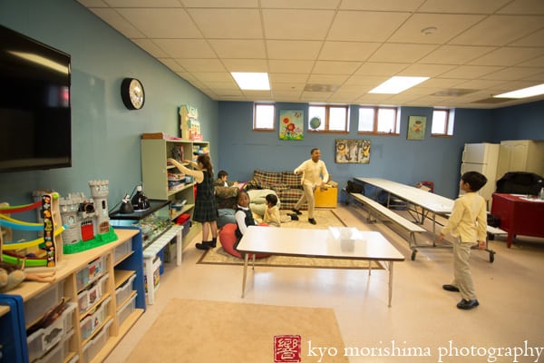
The project was to renovate the after-care room at a local school, the Wardlaw-Hartridge School. The room was somewhat dark and cluttered and furnished mainly with hand-me-downs. Our task was to brighten the room significantly and make it feel like “home”: clean, cozy, and inviting. Here’s a “before” shot of the room:
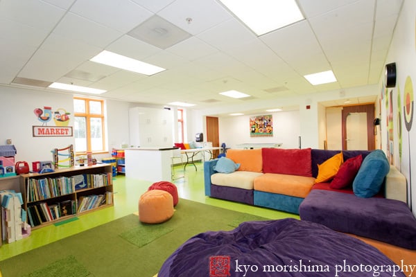
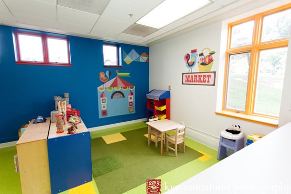
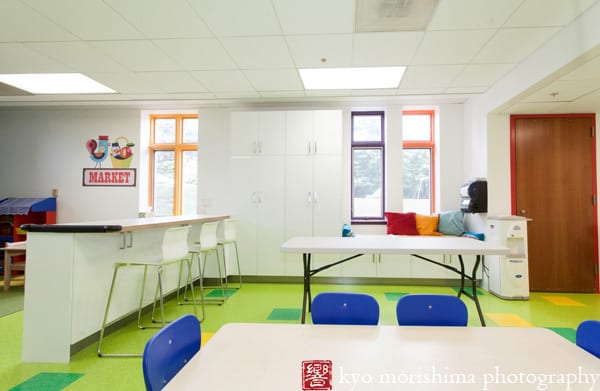
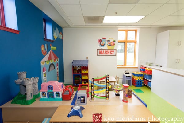
And here’s the “after” shot:
The Kids Were Our Clients
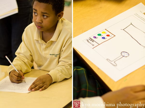
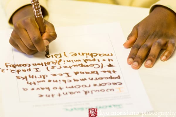
We decided that in order to make a space that really felt homey, we needed to ask the students themselves what would make them feel happy and comfortable there. So we spent an afternoon interviewing them and having them write about and draw their “dream room.” They were thrilled to offer their opinions!
So, after having compiled a wealth of suggestions for the new room (including some proposals that, sadly, we weren’t able to incorporate, like a hot tub or ice cream bar), we distilled it to a list of what we wanted:
- clean, white walls with bold and colorful artwork
- plenty of storage space and shelving to keep things neat and tidy
- soft, playful upholstered furniture for the “lounge area”
- durable, low-maintenance, kid-friendly materials
- a division of the room into clear zones so that the little kids wouldn’t get trampled and the big kids would have their own space
The Final Result
Here’s what the room looked like after we finished:
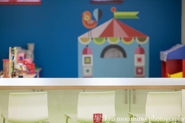
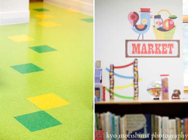
The wall decals are designed by Ellen Giggenbach and printed by ProDPI. The walls are painted in Benjamin Moore with contrasting trim on the windows and door frames. The floor is a random tile pattern in Armstrong Rave VCT, with carpet tile by Flor. The toy furniture is from Discount School Supply.
The cabinetry is Akurum/Abstrakt from Ikea, with Ikea Glenn bar stools.
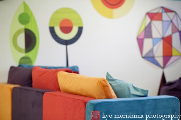
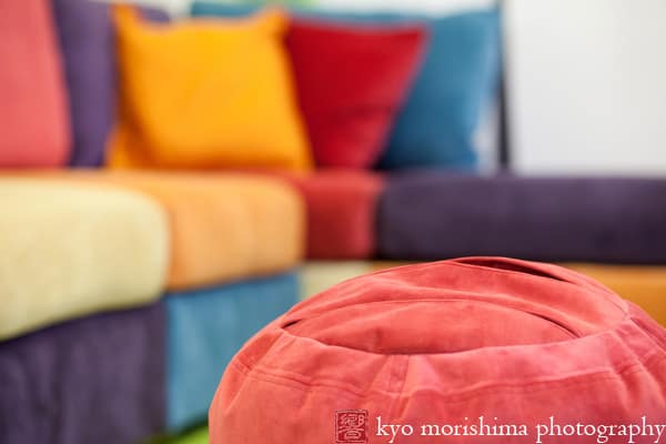
The colorful couch and beanbag are from Lovesac:
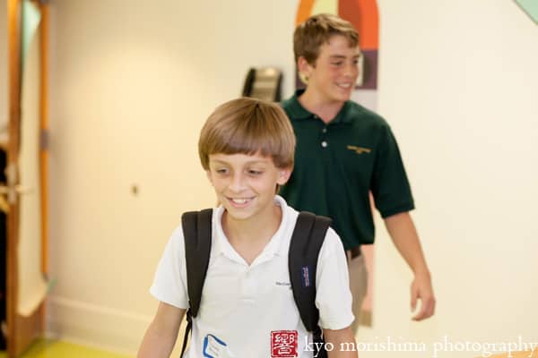
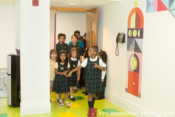
And here are the kids’ reactions when they first walked into the room:
They embraced the big beanbag right away!
Here’s a list of the companies from whom we sourced for this project:
Artwork: Ellen Giggenbach
Wall decal printing: ProDpi
Couch and beanbags: Lovesac
Floor tile: Armstrong Rave VCT
Carpet tile: Flor Made You Look, Rake Me Over
Cabinetry: Ikea Abstrakt
Stools: Ikea Glenn
Toy furniture: Discount School Supply
Paint: Benjamin Moore (walls: Simply White, Laguna Blue; window and door frames: passion plum, bright yellow, sharp cheddar, festive orange, neon red)
Interior design and photography: Kyo Morishima Photography

