Fine Art Wedding Album
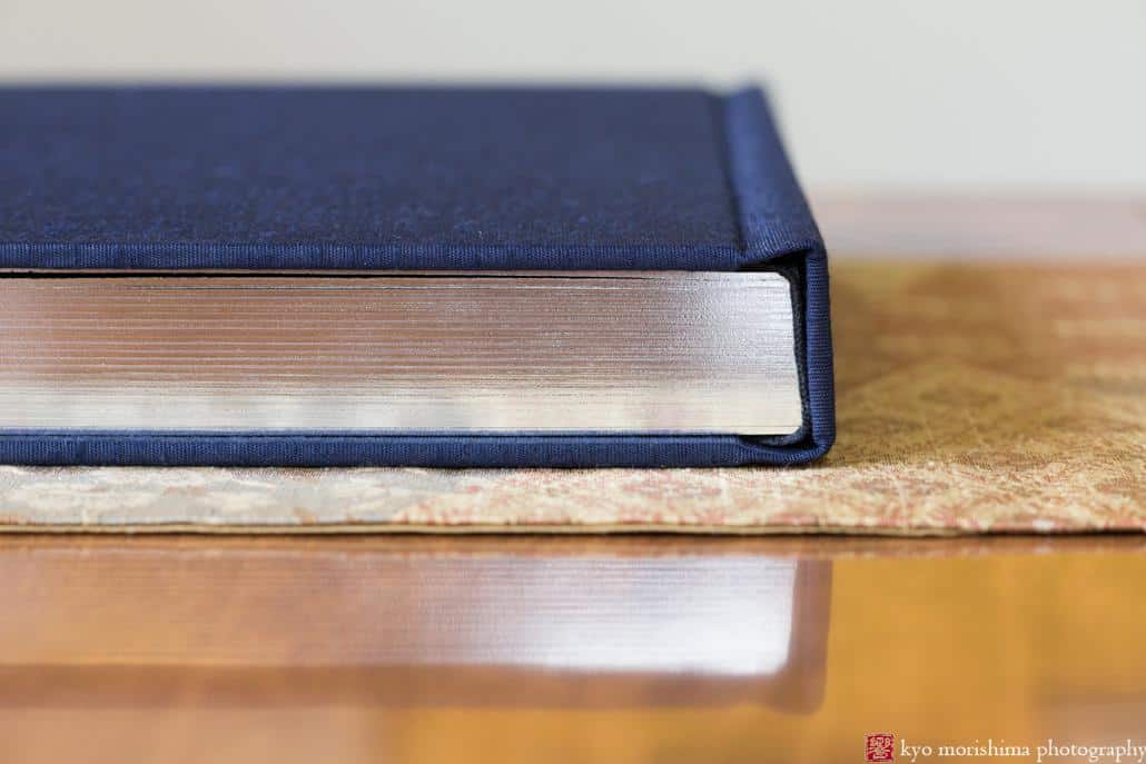
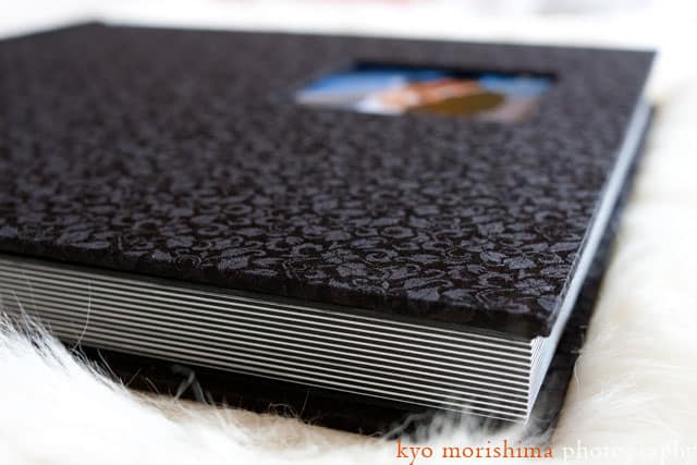
Our Fine Art Wedding Album is the standard option we offer our wedding clients. It’s a 12″ by 12″ album with inset cover photo, bound in silk or leather, and can have page edges gilded in silver or gold.
We love designing wedding albums because they are one of the best ways to use photography’s story-telling strengths. With an album, you are curating specific photographs and consciously organizing them in a specific way, leading the viewer from beginning, to middle, to end.
A great wedding album should start by setting the scene, then give the viewer a visceral sense of how the day unfolded. It should elicit moments of strong emotion — from anticipation, to tears, to big smiles and laughter, to love and joy.
Here you can see one of our sample albums in its entirety:
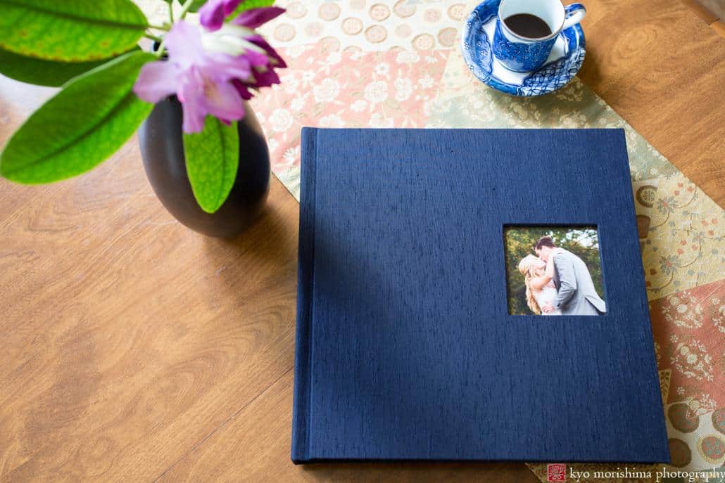
There are more than fifty different cover material options. For this particular album, I chose midnight blue silk shantung to match the deep blue color palette at the wedding. The inset cover photo is 3 1/2″ by 3 1/2″.
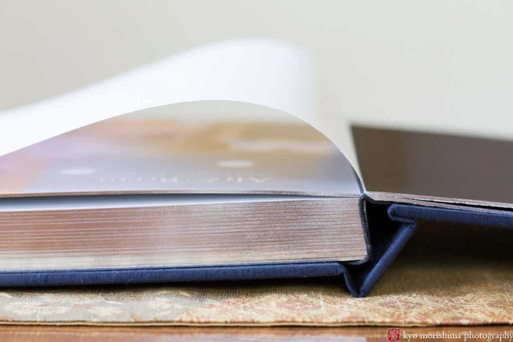
One of the Fine Art album’s unique features is the rice paper sheet covering the first page, a lovely little detail that signals the beginning of the book. This shot also gives you a close-up look at the silver leaf page gilding.
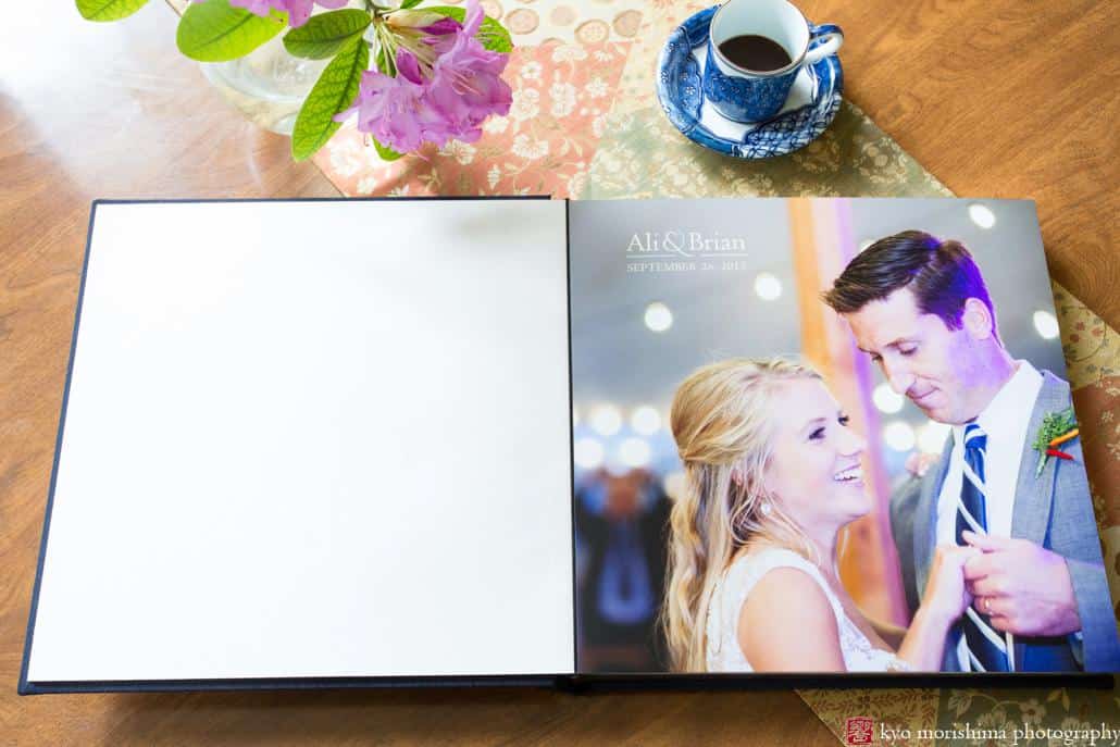
And here’s a look at the title page design:
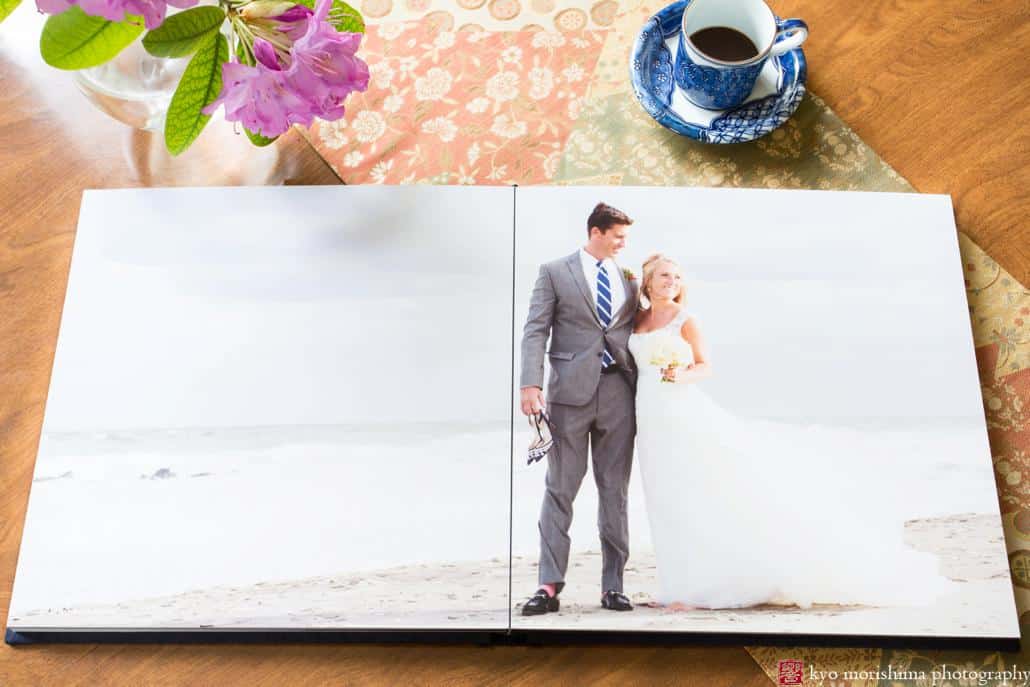
The Fine Art Album is a “flush-mount” album. This means that the photographs are dry-mounted “flush” (i.e., covering the full page) onto archival matboard.
Although technically, flush-mount albums offer an infinite variety of layouts (unlike matted albums), one of our key principles is to keep the page designs as simple as possible. Ideally, the viewer should be absorbed in the images, and not even notice that the album was “designed” at all.
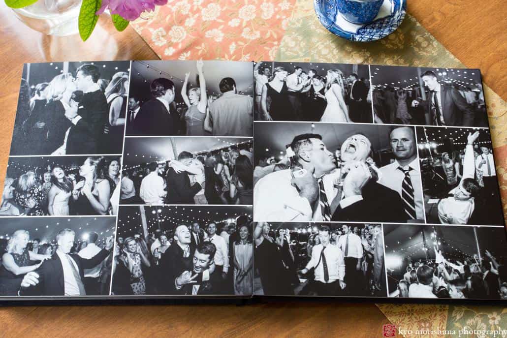
Most spreads contain two or three images, or a single full-spread photograph. But for certain moments, like wild partying on the dance floor, we break our own rules and design a collage of many images, to convey a sense of the energy and action. Here you can see the contrast between a single moment during the portrait session on the beach, and a mashup of moments from the reception:
If you have any questions about our albums, we’d love to hear from you!
